FitnessSyncer Dashboard
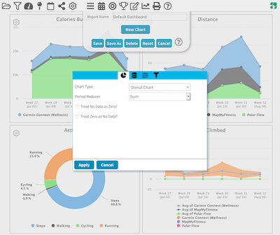
FitnessSyncer Dashboard is a reporting dashboard that allows you to see your health and fitness over time via graphs and charts. Quickly spot trends or anomalies in your exercise routines and stay motivated.
The Dashboard is entirely based on the data which you have in FitnessSyncer, so to get started with the Dashboard, add Data Sources or a FitnessSyncer Notebook entry.
You may filter your data using the filter icon , where you can remove duplicate data or select the sources used in the display. FitnessSyncer Pro users can also choose the types of activities they would like to be shown, such as only showing Runs, Swims, and Cycling trainings.
By default, we show the data in a weekly granularity. You can change this by selecting the chart granularity icon and you may choose between day, week, or month.
You can control the imperial or metric setting and time zone of the display on the Dashboard on your Profile. Note that if you have saved a copy of the Dashboard, you may need to manually change the data for the charts to reflect your preferences.
You can also share the Dashboard with your family, friends, and colleagues via the share icon . When you select this option, you will be asked if you wish to share the current Dashboard or all Dashboards, and will then have the ability to share the item on Facebook, X, E-mail, or to post a link. You can revoke your sharing on the Sharing section of your Profile.
Any chart worth a closer look can fill the screen. Hover it and press the expand icon in its top corner, and the chart is drawn at the size of the whole window. Press the close icon or the Escape key and it goes back where it was, at the size it was. This is just a way of looking at a chart, so nothing is saved: filters, granularity and the chart itself are all unchanged, and a pivot’s filters can still be applied while the chart is full screen.
Click a point on any chart with a date along the bottom to write an annotation about what was happening, so that a spike still makes sense to you months later. Annotations follow the measurement rather than the chart, so one annotation shows up wherever that data is drawn.
A chart drawn a day at a time is a summary, and the readings underneath it are often far more detailed. Where that is true, the chart offers a second icon beside the expand one. Press it and the chart fills the screen showing what was actually recorded, with a row of buttons across the top for how closely to look. A chart of days offers Per hour and Per minute, a chart of months offers Per day, and so on. This appears only when there is enough data to be worth it, so a Temperature chart built from two readings a week does not offer it. Per minute is a FitnessSyncer Pro feature; every other level is available to everyone.
Every chart can also show you the numbers behind it. Press the table icon beside the expand one, and the chart’s own values open as a table you can read and sort by any column, with the dates down the side and one column per series. A Download button on that table saves the same numbers as a CSV file, ready to open in a spreadsheet.
The note editor offers the same thing for one point. Clicking a Tuesday on a chart of days gives you a Show each hour of that Tuesday button above the note, which opens those hours rather than the most recent ones. Either way this is only a way of looking at your data, the same as going full screen: nothing is saved, the chart itself is untouched, and closing the window puts the chart back exactly as it was.
Users on our free tier can only see the most recent 30-day’s worth of data and cannot customize the dashboard. Learn more about becoming a FitnessSyncer Pro.
Available Reports
FitnessSyncer includes a few ready-made reports you can open from the Report Load menu . These are available to every account, including the free tier:
- Default Dashboard: The standard dashboard shown when you first visit FitnessSyncer Dashboard, with charts visualizing your health and fitness data.
- Health Report: A quick snapshot of your latest health data — your Personal Details along with your most recent Blood Pressure, Glucose, Cholesterol, and Weight readings, plus your current Allergies, Conditions, and Medications.
- Heart Report: Charts tracking your heart health over time, including Resting, Minimum, Maximum, and Average Heart Rate, Heart Rate Variability (HRV), Oxygen (SpO2), Respiratory Rate, Sleeping Heart Rate, and Sleep by Type.
- Diabetes and Glucose Report: Charts tracking your Glucose, an Estimated A1C from your average glucose over the last 90 days, your time spent in, above, and below range, Glucose by Time of Day, Glucose versus Carbohydrates and Glycemic Load, and your combined nutrition information.
- Sleep Quality Report: Charts tracking your Sleeping Hours, Sleep Efficiency, Sleep Debt, HRV, Sleeping Heart Rate, Sleep by Type, Awakenings, and Settling Time. It also lays your recent nights out one under another, each divided into the stages your device recorded, so you can see when you were in deep sleep or awake and for how long.
- Body Composition Report: Charts tracking your Weight, Body Mass Index, Fat Ratio, Fat Mass, Fat Free Mass, Muscle Mass, Body Water Percentage, Bone Mass, and a combined chart of your Fat Mass, Muscle Mass, and Bone Mass.
- Blood Pressure Report: Charts tracking your Systolic and Diastolic Blood Pressure, Pulse Pressure, number of Blood Pressure Measurements, Mean Arterial Pressure, and Pulse.
- VO2 Max and Fitness Age Report: Your latest VO2 Max, Fitness Category, and Fitness Age, along with a chart tracking your VO2 Max over time.
- Cycle Tracking Report: Charts tracking your logged Flow Level, Basal Body Temperature, Cervical Mucus, and Ovulation Test results over time.
- ECG Report: A summary of the ECG recordings synced from your Apple Watch, Fitbit, Withings, or other ECG-capable device — how many you have taken, how they break down by the classification your device reported, and the waveform of your most recent recording. The classification always comes from the device that made the recording and is not for diagnostic use.
- Trends: What actually changed. We compare the last four weeks of each metric we watch against the three months before them, and tell you only about the ones that really moved — a change has to be both statistically significant and large enough to matter before it earns a place, so an ordinary month says very little. Each change gets a chart showing the two averages side by side, and a table lists the rest, including anything we could not check because too few days were logged.
- Data Overview: A look at where your data comes from and where it’s being sent, including a diagram of your Data Sources and Destinations.
- Goals Report: How you are doing against the goals you have set. Recurring goals — a daily step count, a weekly distance — show how often you hit them, your current streak and your best one, with a chart marking every period you met the target. A goal with a fixed target, such as a weight to reach, instead gets an estimate of when you will get there at your recent rate.
If you are using one of our apps, the Reports also include Your Best and Leaderboards.
FitnessSyncer Pro users also have access to the FitnessSyncer Report Sampler described below.
You can hide any of these built-in reports from the Report Load menu without deleting anything; see Default Report List and FitnessSyncer Notebook Categories on the Preferences page.
Dashboards for FitnessSyncer Pro Users
FitnessSyncer Pro users have the most powerful experience on FitnessSyncer Dashboard. You can customize the dashboard, create unlimited reports, advanced filtering capabilities including by sport and date range, and more!
In addition to the ability to Filter by Activity Type, you also can quickly see different views of your data using presets or be able to customize the date range to zoom into the precise data you are interested in.
FitnessSyncer Pro users can also customize and save an unlimited number of Dashboards with many data visualizations to help you get the most of your data.
FitnessSyncer Report Sampler
FitnessSyncer provides a lot of charts and options for chart configuration. To help you get up and running quickly, we have FitnessSyncer Report Sampler, which shows you all of your data in various charts we’ve already created.
See one you like? Click the Gear and then select the Add To Dashboard option. This will allow you to pick the Dashboard you wish to add it to.
All of the charts on this page are based on your data. For example, if you do not have Blood Pressure data, there will not be blood pressure charts.
Dashboard Customization
To customize the FitnessSyncer Dashboard, click the Gear .
When you enter into Edit Mode, you will see a panel at the top of the screen with the current report properties. All of the charts associated with the report (even those without data) will be shown and have a gear menu associated with them.
From the dialog at the top of the screen, you can:
- Change the report name by editing the Report Name
- Create a copy of the report by selecting “Save As” — Note that you cannot save when a Dashboard is still loading.
- Delete the report by selecting “Delete”
- Undo all changes to the report by selecting “Reset”
- Exit edit mode “Cancel”
- Adding new charts to a dashboard by selecting the “New Chart” button.
- Change Report Properties such as colors by using the “Properties” button.
To create a new, blank report, you would do so from the Report Load menu and selecting the icon.
On each of the charts, you can:
- Reorder the charts by simply clicking and dragging charts to the location you wish.
- Change the properties of a chart by the Gear near a chart and selecting the Properties option.
- Clone charts by clicking the Gear near a chart and selecting the Clone Chart to clone the report inline or Clone to Dashboard to clone it to another report.
- Remove charts by clicking the Gear near a chart and selecting the Remove option.
- Change the width of certain charts by clicking the Gear near a chart and selecting the Toggle Width option.
- Download the backing data of most charts by clicking the Gear near a chart and selecting the Download CSV option.
The chart editor fills the screen, with the chart you are working on beside the options rather than behind them. The options are grouped into sections you can open and close, and the box at the top of the list searches all of them at once, so you can type part of a setting’s name instead of hunting through the groups for it.
Changing any option leaves the chart as it was and offers you a Preview button over it, because redrawing means fetching your data again. Press Preview to see the change, or Apply to keep it and close the editor.
While the editor is open, any controls belonging to the chart itself, such as the Trend Comparison chart’s own metric picker, are dimmed and do nothing. They redraw the chart from its saved settings rather than the ones you are editing, so they would undo your changes. Change the chart from the options list instead.
Reference Bands
Several charts are shaded into labelled bands behind your data, such as Normal, Elevated, Fever, and so on. They exist because a number on its own is hard to read: a systolic of 128 or an oxygen reading of 94% means little until you can see which range it falls in. The bands appear automatically on any chart showing a single measurement we have ranges for, on the FitnessSyncer Dashboard, in the built-in reports and in FitnessSyncer Compare.
Where the numbers come from depends on the measurement, and it is worth knowing which kind you are looking at:
- Your own settings. Glucose uses the in-range limits you set on your Profile, and heart rate and power zones use the zones you configured there. If you turn on Use my glucose range instead of the standard ranges to use your high number as the indicator. If a band looks wrong for you, this is the kind you can simply change.
- Your age and sex. VO2 Max and resting heart rate are judged against tables adjusted for your profile, because what is a good resting heart rate at 25 is not the same as at 65. Sleep duration is banded by age alone.
- Fixed ranges. Blood pressure, oxygen, BMI, visceral fat, body temperature and cholesterol use published, widely-used ranges that do not vary by person.
Measurements with bands today: blood pressure (systolic and diastolic), glucose, A1C, oxygen, BMI, visceral fat, VO2 Max, heart rate zones, power zones, ECG heart rate, and — newly — body temperature, cholesterol (total, HDL, LDL and triglycerides), resting heart rate and sleep duration.
A1C is banded on the standard thresholds of 5.7% and 6.5%. The Estimated A1C on the Diabetes and Glucose Report always uses those, so the standard view is always available to you, even when you have asked for your own range elsewhere.
The blood pressure bands changed in September 2026. They now follow the 2017 American College of Cardiology and American Heart Association guideline, which the earlier ranges predated.
Two things to keep in mind. Cholesterol’s HDL runs the opposite way to the others: for total, LDL and triglycerides a lower number sits in the better band, while for HDL a higher one does. And body temperature ranges assume an oral or ear reading; an underarm measurement typically reads lower and a rectal one higher, and we have no way to know which you took.
The bands describe a reading; they do not diagnose one. They are there to make a number readable, not to tell you what it means for your health. Nothing on this page is medical advice, and a reading that concerns you is a conversation for your doctor.
Report Settings
You can change the properties by clicking the Properties button from the report edit mode at the top of the screen.
You can change the colors used in most charts on the Color tab.
You can change the report’s default Graph By setting and scope on the Settings tab.
Chart Configuration
Most of the power in the FitnessSyncer Dashboard for Pro users comes in the ability to add your own charts to the dashboard and to edit the current charts to meet your needs. This section discusses the various options available.
There are 4 chart categories which will be discussed below:
- Charts: this includes all chart visualizations ranging from Area, Line, Pie, and more.
- Key Performance Indicators: this includes key performance indicator summaries either in textual or visual form.
- Collections: these are pre-packaged FitnessSyncer options, such as Goal KPI Set, ShoeRenew Lifetime Reports, Personal Detail Tables, and Allergy, Condition, and Medication reports.
- UI Items: these are pre-packed FitnessSyncer UI elements, such as Report Navigation, Source Filters, and Title sections.
Charts
Charts are graphical visualizations of your data.
FitnessSyncer has two types of charts, one of which can only accept one data element per chart. These charts include:
- Pie Chart
- Donut Chart: Like a Pie chart, but with a hole in the middle
- Heat Map Chart: Shows the popularity of data distribution based on a Heat Map configuration.
- Table Charts: Data shown as a table
The other type of chart allows you to have multiple data items shown. These charts include:
- Area Chart: Chart which the region from 0 to the current item is filled in.
- Area Range Chart: Chart shows the average value as a line and the range of the data as an area around the average.
- Bar Chart: Shows the data in bars
- Box Plot Chart displays the range of your data, great for data like Glucose or Heart Rate, where:
- the bottom whisker (line) is the lowest value
- the top whisker (line) is the maximum value
- the box depicts the range of the 25th to 75th percentile
- the line in the box shows the 50th percentile (median)
- Column Chart: Shows the data in columns
- Histogram Chart: Shows data frequency, such as how many of your runs are 3 miles, 5 miles, etc.
- Item Duration by Day: Similar to the Daily Analyzer, shows your activities and sleep per day by hour and duration.
- Line Chart: Chart with just a line
- Scatter Chart: Scatter Plot shows the relationship between your data based on a Labeler for grouping.
- Spider Chart: Based on categories, spreads data on a spider web.
- Stacked Bar Chart: Bar chart where instead of the categories being side-by-side, they are stacked.
- Stacked Column Chart: Column chart where instead of the categories being side-by-side, they are stacked.
- Variable Pie Chart: Pie chart along two dimensions.
Two options in the chart’s General settings change how a chart reads rather than what it measures:
- Color by goal: on an Area, Line, Column or Bar chart, each point is colored by whether that period met the goal for the field, instead of by the report’s palette. The direction comes from the goal itself, so a step count you want above 10,000 and a calorie count you want below 2,200 both read green when you are on the right side of the line. A period that only just missed is shaded differently from one that missed badly, and what counts as “only just” is worked out from how much that metric normally moves rather than from a percentage you have to pick.
- Hide unless every field has data: on a chart comparing two or more fields, hide the chart entirely when one of them has nothing to show in the period on screen. Without this, a comparison like Glucose against Carbohydrates still draws when you have logged no food, which looks like a finding rather than a gap.
FitnessSyncer Pro users also have Pivot Tables and Pivot Charts, described below, which let you rearrange how your data is broken down without rebuilding the chart.
Pivot Tables and Pivot Charts
Pivot Tables and Pivot Charts are available to FitnessSyncer Pro users, and they are the fastest and easiest way to explore your data. Rather than deciding up front what a chart should show, you pick what to measure and then rearrange how it is broken down until the answer you are looking for appears.
If you have used a spreadsheet’s pivot tables, these will feel familiar. On the Data section you fill in four lists:
- Values: what is being measured, such as Calories, Distance, or Average Heart Rate. You can add more than one.
- Rows: how the data is broken down down the side of the table, such as by Activity.
- Columns: how the data is broken down across the top, such as by month.
- Filters: which values to include, chosen right on the finished table or chart rather than in the editor.
Rows and Columns can each hold more than one entry, which nests them — Activity within Provider, for example — and you can drag the entries to reorder them. Each measure is summarized the way that measure is normally summarized, so Calories are totalled while Average Heart Rate is averaged, and you do not have to choose.
What you can break the data down by depends on what you are measuring. Alongside Date, Activity, Provider, Source, Meal, and Glucose Context, FitnessSyncer offers the descriptive fields inside the data itself — whether an activity was entered by hand or recorded by a device, an activity’s Title, which food a nutrition entry was for, a cycle tracking entry’s Flow Level, an ECG’s Classification, and so on. Each of these is named after the kind of data it comes from, such as “Nutrition: Food” or “Sleep: Sleep Type”, so you can tell at a glance which ones suit what you are measuring.
Two of them apply to everything you track, whatever you are measuring: Tag, and Comment. Because an entry can carry several tags at once, picking a tag in the Filters list gives you every entry carrying that tag, even if it has others too. Used as a Row or Column instead, an entry’s tags are shown together as one group, so the totals still add up.
Comment tells you whether you wrote a note on an entry rather than what the note said — grouping by the note itself would give you one row per entry.
Choosing Date lets you also choose how finely to break it up — by day, week, month, or year.
Filters
Anything you put in the Filters list appears above the finished table or chart as a set of checkboxes, one per value actually present in your data. Tick the ones you want and press Apply. Long lists can be searched, and unticking everything gives you an empty table rather than putting everything back.
Filtering this way is temporary and only affects your current view, so you can explore freely without changing the report. Save the report to keep the filters you have chosen. If you set them while editing the chart, they become the chart’s starting point every time it is loaded.
Filters also work in the FitnessSyncer apps for iOS and Android. Tick the values you want and tap Apply, and just that table or chart is redrawn. As on the website, what you choose in the apps only changes your current view; to keep a set of filters, save the report on FitnessSyncer.com. Older versions of the apps show a Pivot Table or Pivot Chart with its saved filters already applied, without the checkboxes.
Pivot Charts
A Pivot Chart is the same thing drawn as a graph instead of a table; the same Rows, Columns, Values, and Filters, so you can build one and see it either way. Choose the shape with the Draw As option at the top of the Data section ; only the shapes that can sensibly draw a table of numbers are offered, and a Pie or Donut will use the row totals.
As with other charts, you can read a Pivot Table’s underlying data with the table icon beside it, and download it from there.
Key Performance Indicators
Key Performance Indicators are summaries of your data into a single numerical value which can help quickly drive action.
To produce the single numerical value, Key Performance Indicators summarize the data first by data period (Daily, Weekly, or Monthly per the Chart Granularity ), and then summarizes each of the periods to produce a single end value.
There are three types of Key Performance Visualizations:
- Key Performance Indicator: This is a textual representation of the number, which includes the number, unit, and title.
- Solid Gauge: This is a percentage-based representation of the number, which shows the number on a gauge up to 100%.
- Three Ring Chart: This is a percentage-based representation of up to 3 individual percentages.
For the Key Performance Indicator, blood pressure and body mass index values will be colored based on whether it is considered high or not. You can disable this in the chart’s General settings .
A Key Performance Indicator can also carry a small graph of the periods behind the number. Turn on Include graph in the chart’s General settings and the tile gains a sparkline of each period that went into the value, so you can see whether a figure you are happy with arrived steadily or in one spike. Where the change from the previous period is larger than the metric normally moves, the tile also reports that change; a difference smaller than the usual variation is left off, because calling ordinary week-to-week movement a trend is how a number starts to mislead.
For the Solid Gauge and Three Ring Charts, the numbers should be a percentage to make sense on the chart. Otherwise, the results may not make sense. If you are a user of FitnessSyncer Goals, we will automatically convert Goal-based metrics to a percentage based on the stated goal.
Collections
FitnessSyncer provides two different types of collections.
The first type of collection is the Preconfigured Collections, which you can choose from:
- Goal KPI Set: This is a set of Key Performance Indicators all based on your configured goals and shows you data such as how often you have met your configured goals.
- Goal Progress by Period: A grid of every goal you have set against each recent period, colored by whether that period met its target, with the figure you recorded in each cell. It answers “which goals am I actually keeping?” across all of them at once, which a chart per goal cannot.
- Goal Progress Today: One bar per goal showing how far along you are toward today’s target, with the target marked. Goals that run downward, such as a weight or calorie ceiling, are drawn the same way as goals that run upward, so a full bar always means you are doing well.
- ShoeRenew Lifetime Solid Gauge Set: This will display a Solid Gauge for each of your configured FitnessSyncer ShoeRenew tasks so you can quickly tell how your shoes or other tracked equipment is doing.
The second type of collection is the Preconfigured Table Collection, which you can choose from:
- Personal Details Table: This table shows you your personal details.
- Allergies: These tables will allow you to show all, current, or past allergies you have had.
- Conditions: These tables will allow you to show all, current, or past conditions you have had.
- Medications: These tables will allow you to show all, current, or past medications you have been on.
UI Items
To help you create very usable Dashboards, we have included a set of UI components.
Report Navigation
Report Navigation allows you to link a few dashboards together and quickly navigate to them by picking one.
When you select this option, the Reports section will appear when you can drag reports you have previously created from the Reports Available section to the Reports section or to reorder items in the list.
Section Break
Section Break divides sections of reports. It does not include any visual change on the dashboard itself.
Source Filter
Source Filter allows you to quickly filter based on a particular source based on its name. For example, if you name your Activity and Sleep feeds the same name for Fitbit, you can quickly filter the report to just the data from Fitbit using this option.
Title
The Title item allows you to put in labels within the reports. In the General section you can enter in a Title, Subtitle, and for select accounts, Images.
Chart
The Chart section is where one selects the chart type (as described above) and options for that chart. Options are based on the chart type itself and include:
- Number Format Styling, such as whether to show the decimal or not or whether the results are time-based.
- Labeler: Some charts require the data to be labeled to make sense on the chart.
- Scatter Type: Type of scatter Algorithm.
- Reducer per Period
- Reducer for the Final Result for Key Performance Indicators
- Heat Map Type
- Table Sorting and Grouping
- Table option for creating a Goal-based table.
- Table option for adding the total row (if more than 1 row present)
- Data Order Reversal for Charts like Column Charts
- Granularity for the data, including by Second, Minute and Hour if your data sources permit. A chart draws one point for every period, so the finest settings cover a shorter span than the rest: a chart by Minute shows the last three days and a chart by Second shows the last day, while Hour and everything coarser uses the whole date range you have selected.
- How do you wish to treat No Data? You can either treat it as not present (default) or 0.
- How do you wish to treat zero? You can either treat it as 0 (default) or not present.
Labelers include:
- Source of the Data (Default)
- Time of Day
- Relative Time of Day (such as Morning, Noon, Evening)
- Meal (such as Breakfast, Lunch, Dinner)
- Activity Name
- Data Unit
- Glucose Context
- Static values, such as Calories
Data
The Data section is shown whenever data is required.
If the chart requires a single item, the UI will be a simple data selector for the data type.
If multiple items can be used, you can add many data items to the chart or remove items from the current list. We recommend that you do not mix disparate data types, for example, displaying Miles and Kilometers data fields.
A few charts that require a certain number of data fields to be entered. For example, the Variwide Pie Chart requires exactly two data fields, and the Three Ring Chart requires at most three data fields.
General
The General section is shown for various chart contexts. It includes the following settings based on the current chart:
- Title of the Chart
- Subtitle of the Chart
- Option to show certain charts as 100% width as opposed to the natural size of the chart.
- Option to show something even if the chart has no data.
- Option to show or hide the X and Y Axis on the Charts themselves
- Option to show goals as part of the Chart.
- Ability to override the Scope and Graph By options for the chart.
Filters
Most charts will include a Filters section if it works with data. These filters work identically to other FitnessSyncer Filters.